Keller Studio Inc.

Reconsidering the Midcentury Workplace

Keller Studio • Nov 23, 2018

Commercial office buildings from the 1960s and 1970s that were initially considered to be architecturally progressive and modern, but now may seem outdated, exist in cities large and small across the U.S.and worldwide.

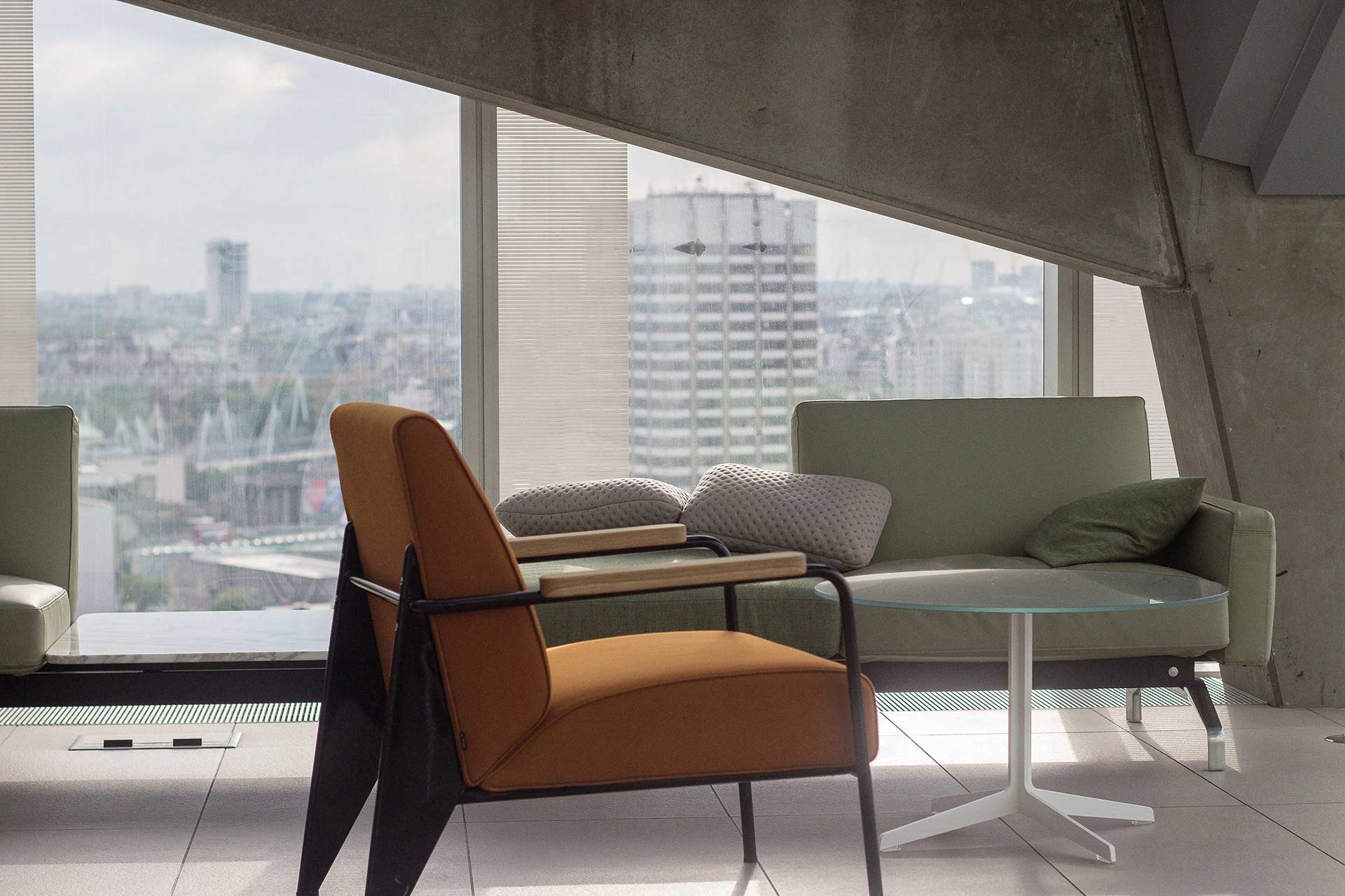
Green sofa, orange chair and small glass table


Commercial office buildings from the 1960s and 1970s that were initially considered to be architecturally progressive and modern, but now may seem outdated, exist in cities large and small across the U.S.and worldwide. Some of these structures constitute highly notable architecture of the era and others are fairly nondescript. 


Today, one may say that they are outmoded, designed for a different time, and ill-suited to contemporary needs. Yet, structural integrity, embodied energy, embedded history, and other considerations compel owners and their designers to apply ingenuity to adapt such structures—capturing the best attributes and transforming them into both highly functional buildings and captivating neighborhood anchors. My colleagues and I at the architecture and design firm BNIM relish the challenges of transformative reuse. 


Superior, human-centered, high-performance spaces can be created within almost any context. Keeping people first in mind leads us to craft spaces that support well-being by providing generous volumes allowing for flexibility and individual choice. Two projects—both of which are the renovations of mid century modern office buildings for new workplace uses—illustrate how we put people first in design for reuse.One year ago, BNIM completed the renovation of the American Enterprise Group (AEG) national headquarters, a prominent building in Des Moines, Iowa, designed by Gordon Bunshaft of Skidmore, Owings & Merrill and completed in 1965.


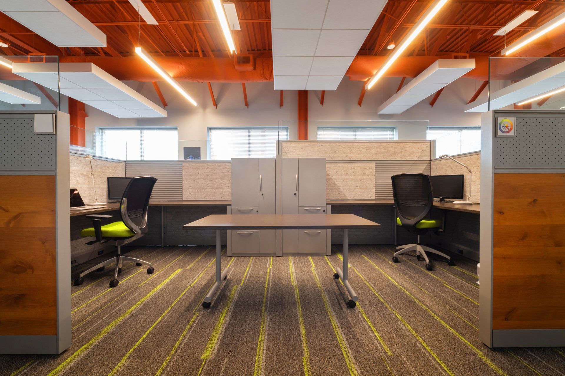
The eight-story, 154,000-square-foot redesign by BNIM was planned forAEG’s 330 employees at the time of the renovation, as well as the 150 additional hires anticipated through 2017. AEG had amassed an impressive art collection over the past 50 years and, while some of it was displayed, it had never before been fully integrated into the interiors. Therefore, an important aspect of the renovation was the consideration of all surfaces, views, and spatial experiences with respect to the art to honor the high-quality collection.Advanced for its time, the AEG building’s minimal internal structure is open with a 90-foot wide clear span, allowing for few obstructions. As part of the renovation, transparent or unobtrusive design elements, including custom sliding glass door office enclosures and a new modern open-office system, were designed to preserve the expanse. 


The company’s previous taller and incongruous furniture system panels were removed and replaced with low-profile furniture systems, allowing all employees to have views. Workstations throughout include sit-stand desks and task lighting.Due to the exposed nature of the structure, technology integration has always been challenging within the AEG building. Therefore, one renovation solution was to more seamlessly integrate new pathways for wiring and technology to both support current needs as well as to provide flexibility for making adaptations over time.Contemporary life-safety standards were met in a non detrimental manner, which was challenging, though, with the sprinkler system integrated within the exposed structural ceiling. 


The 50-year-old building previously had very limited environmental controls. We installed new control options to create an interior that responds to localized occupancy comfort needs. Nearly 230 thermostats now control the building’s systems, giving quadrants on each floor the ability to adjust temperatures. In addition, window replacement, insulation upgrades, and new mechanical, electrical, and plumbing systems deliver significant energy savings. Prior to the renovation, the building was consuming 171k Btu/sf/yr. The interiors now operate on 59.25 kBtu/sf/yr, representing a65 percent energy savings. 


The renovation and repair will save the company up to $2 million annually. BNIM’s new office at Crown Center By the end of this year, the Kansas City, Missouri, office of BNIM will move into the Pershing Road buildings at Crown Center, which we are renovating. The Pershing Road building complex, a Brutalist office structure designed by Edward Larrabee Barnes and completed in 1972, was state of the art for its time and unusual: It was conceived as a skyscraper laid on its side. The complex has been the headquarters for Hallmark Cards, which is consolidating its footprint. As a result, floors have become available, including the space BNIM will soon occupy.Crown Center’s Pershing Road office building includes six connected office structures that total nearly 600,000 square feet. With 100 employees in 20,000 square feet on parts of two floors, BNIM will be the first to move into the 270,000 square feet of space coming to market at the multi-use complex. 


For BNIM, taking on this project and choosing to move into the complex posed interesting questions: How does a design firm, working with an owner on behalf of tenants including itself, reimagine a complex from an era that is not necessarily viewed fondly by today’s culture?Many have considered the Crown Center complex to be tired and dated at best, but we saw potential. BNIM loved the idea of this challenge. Doing something transformative in an existing facility is irresistible to me and my colleagues. Doing it well—for our own office, especially, so that we can also continue to“tinker” with spatial choices over time—will showcase our culture of curiosity and allow us to demonstrate creativity in a context that we can apply to many future projects. 


Our new workplace is being designed as a laboratory for exploration and research, with space for education, community outreach, and exhibits in a highly engaging work environment in which we will be encouraged to be mobile and change postures throughout the day. The workspaces will be based upon variety, choice, and the ability to personalize. Part of the thrill and challenge of reimagining Crown Center is the design dialogue with an existing space. For example, on paper, the 12-foot floor-to floor heights are not the tall volumes that are highly desirable for today’s workplace, so we knew we had to leverage and exaggerate the strong horizontal qualities of the space to our advantage. 


One strategy is to enhance the daylight coming through horizontal windows along the perimeter. To achieve this,rows of dated office cubicles and tall partitions have been removed, the number of new internal walls will be minimized, and several communal spaces will be integrated. Ceiling tiles have been removed to expose the concrete pan joist structural system with a strong lateral rhythm. We also cut a few new skylights to both bring light deeper into the 90-foot-deep floor plate and provide views to the sky.One key early decision was the selection of a space at grade with access to the neighborhood and its communal garden. With biophilia inspiring our design strategy, we have connected our office to the outdoors by organizing the studio and our shared spaces in proximity to the garden.


This allows us to create our own front door and identity within a large, sprawling office complex of sameness. Both visitors and staff will share a common point of entry into our studio through a gallery and bistro, and will be encouraged to use a centrally located stair. A portion of the upper floor has been removed to insert the new staircase, enhancing interaction and connectivity between the two levels. There use of old buildings is almost always more complex than buildinganew. Such projects demand integrated thinking and creativity, and sometimes a leap of faith. 


Given pressures on materials and resources,this type of project will be increasingly appreciated by owners and neighbors alike. Each project is a chance to consider adaptation strategies, encourage others to take a second look, and explore the possibilities of how seemingly dated structures can once again serve and even inspire in unexpected ways.James Pfeiffer, AIA, is an associate principal, project architect, and designer in the Kansas City, Missouri, office of BNIM. His portfolio spans a variety of building types, including convention centers, outdoor plazas, office towers, andparking facilities. His background includes significant roles in architectural design, concept development, construction documentation,and administration.

 

Cook Children's Org
27 Jul, 2019
News about Cook Children's, voted as one of the top 20 most beautiful hospitals in the US
Office interior
By Keller Studio 23 Nov, 2018
Commercial office buildings from the 1960s and 1970s that were initially considered to be architecturally progressive and modern, but now may seem outdated, exist in cities large and small across the U.S.and worldwide. Some of these structures constitute highly notable architecture of the era and others are fairly nondescript. Today, one may say that they are outmoded, designed for a different time, and ill-suited to contemporary needs. Yet, structural integrity, embodied energy, embedded history, and other considerations compel owners and their designers to apply ingenuity to adapt such structures—capturing the best attributes and transforming them into both highly functional buildings and captivating neighborhood anchors. My colleagues and I at the architecture and design firm BNIM relish the challenges of transformative reuse. Superior, human-centered, high-performance spaces can be created within almost any context. Keeping people first in mind leads us to craft spaces that support well-being by providing generous volumes allowing for flexibility and individual choice. Two projects—both of which are the renovations of mid century modern office buildings for new workplace uses—illustrate how we put people first in design for reuse.One year ago, BNIM completed the renovation of the American Enterprise Group (AEG) national headquarters, a prominent building in Des Moines, Iowa, designed by Gordon Bunshaft of Skidmore, Owings & Merrill and completed in 1965. The eight-story, 154,000-square-foot redesign by BNIM was planned forAEG’s 330 employees at the time of the renovation, as well as the 150 additional hires anticipated through 2017. AEG had amassed an impressive art collection over the past 50 years and, while some of it was displayed, it had never before been fully integrated into the interiors. Therefore, an important aspect of the renovation was the consideration of all surfaces, views, and spatial experiences with respect to the art to honor the high-quality collection.Advanced for its time, the AEG building’s minimal internal structure is open with a 90-foot wide clear span, allowing for few obstructions. As part of the renovation, transparent or unobtrusive design elements, including custom sliding glass door office enclosures and a new modern open-office system, were designed to preserve the expanse. The company’s previous taller and incongruous furniture system panels were removed and replaced with low-profile furniture systems, allowing all employees to have views. Workstations throughout include sit-stand desks and task lighting.Due to the exposed nature of the structure, technology integration has always been challenging within the AEG building. Therefore, one renovation solution was to more seamlessly integrate new pathways for wiring and technology to both support current needs as well as to provide flexibility for making adaptations over time.Contemporary life-safety standards were met in a non detrimental manner, which was challenging, though, with the sprinkler system integrated within the exposed structural ceiling. The 50-year-old building previously had very limited environmental controls. We installed new control options to create an interior that responds to localized occupancy comfort needs. Nearly 230 thermostats now control the building’s systems, giving quadrants on each floor the ability to adjust temperatures. In addition, window replacement, insulation upgrades, and new mechanical, electrical, and plumbing systems deliver significant energy savings. Prior to the renovation, the building was consuming 171k Btu/sf/yr. The interiors now operate on 59.25 kBtu/sf/yr, representing a65 percent energy savings. The renovation and repair will save the company up to $2 million annually. BNIM’s new office at Crown Center By the end of this year, the Kansas City, Missouri, office of BNIM will move into the Pershing Road buildings at Crown Center, which we are renovating. The Pershing Road building complex, a Brutalist office structure designed by Edward Larrabee Barnes and completed in 1972, was state of the art for its time and unusual: It was conceived as a skyscraper laid on its side. The complex has been the headquarters for Hallmark Cards, which is consolidating its footprint. As a result, floors have become available, including the space BNIM will soon occupy.Crown Center’s Pershing Road office building includes six connected office structures that total nearly 600,000 square feet. With 100 employees in 20,000 square feet on parts of two floors, BNIM will be the first to move into the 270,000 square feet of space coming to market at the multi-use complex. For BNIM, taking on this project and choosing to move into the complex posed interesting questions: How does a design firm, working with an owner on behalf of tenants including itself, reimagine a complex from an era that is not necessarily viewed fondly by today’s culture?Many have considered the Crown Center complex to be tired and dated at best, but we saw potential. BNIM loved the idea of this challenge. Doing something transformative in an existing facility is irresistible to me and my colleagues. Doing it well—for our own office, especially, so that we can also continue to“tinker” with spatial choices over time—will showcase our culture of curiosity and allow us to demonstrate creativity in a context that we can apply to many future projects. Our new workplace is being designed as a laboratory for exploration and research, with space for education, community outreach, and exhibits in a highly engaging work environment in which we will be encouraged to be mobile and change postures throughout the day. The workspaces will be based upon variety, choice, and the ability to personalize. Part of the thrill and challenge of reimagining Crown Center is the design dialogue with an existing space. For example, on paper, the 12-foot floor-to floor heights are not the tall volumes that are highly desirable for today’s workplace, so we knew we had to leverage and exaggerate the strong horizontal qualities of the space to our advantage. One strategy is to enhance the daylight coming through horizontal windows along the perimeter. To achieve this,rows of dated office cubicles and tall partitions have been removed, the number of new internal walls will be minimized, and several communal spaces will be integrated. Ceiling tiles have been removed to expose the concrete pan joist structural system with a strong lateral rhythm. We also cut a few new skylights to both bring light deeper into the 90-foot-deep floor plate and provide views to the sky.One key early decision was the selection of a space at grade with access to the neighborhood and its communal garden. With biophilia inspiring our design strategy, we have connected our office to the outdoors by organizing the studio and our shared spaces in proximity to the garden. This allows us to create our own front door and identity within a large, sprawling office complex of sameness. Both visitors and staff will share a common point of entry into our studio through a gallery and bistro, and will be encouraged to use a centrally located stair. A portion of the upper floor has been removed to insert the new staircase, enhancing interaction and connectivity between the two levels. There use of old buildings is almost always more complex than buildinganew. Such projects demand integrated thinking and creativity, and sometimes a leap of faith. Given pressures on materials and resources,this type of project will be increasingly appreciated by owners and neighbors alike. Each project is a chance to consider adaptation strategies, encourage others to take a second look, and explore the possibilities of how seemingly dated structures can once again serve and even inspire in unexpected ways.James Pfeiffer, AIA, is an associate principal, project architect, and designer in the Kansas City, Missouri, office of BNIM. His portfolio spans a variety of building types, including convention centers, outdoor plazas, office towers, andparking facilities. His background includes significant roles in architectural design, concept development, construction documentation,and administration.
Show More
Share by: